Consumer Trade-In & Diagnostic Mobile Experience
Overview
When someone trades in an old phone, they want to know two things: what it's worth, and that they're not going to get lowballed once it's actually in the store's hands. The existing process couldn't promise either — customers filled out a vague, text-based questionnaire about their phone's condition, and the trade-in value they were quoted often didn't match what they got once a warehouse tech inspected the device in person. I designed the mobile diagnostic flow that fixed this by letting the phone test itself.
This project reached the final prototype before being deprioritized and didn't ship. The design thinking below reflects what it was built to solve.
The Problem
Self-reported condition forms don't work well for something like a phone trade-in. Customers either overestimate their phone's condition and get a lower offer in-store than they expected, or they get flagged incorrectly by a manual test — a smudge or a fingerprint on the screen misread as damage, a phone that's actually fine getting marked "broken." Both versions of the problem cost the business money and cost the customer trust.
The existing flow also assumed a level of technical comfort a lot of customers didn't have. Text-heavy condition questions asked people to self-diagnose things like screen delamination or battery health — reasonable for someone technical, confusing for most people.
My Role
I was the lead mobile UX designer on this project. That meant designing the diagnostic flow itself, but also sitting in the room with backend engineering and retail operations to make sure the technical requirements on their end didn't turn into a confusing experience on the customer's end. Accessibility (AODA compliance) was part of the brief from day one, not a pass at the end — full screen-reader support, and alternatives for any interaction that assumed a customer could shake, tap, or see the screen.

The Solution
Discovery & mobile architecture
The locked phone problem
Customers mailing in a phone without removing their personal lock screen was causing shipments to get stuck in limbo. I designed a hard-stop step that catches this before the customer ships the phone, not after.
One System, 100+ Devices
I built this as a component system in Figma rather than a fixed layout, so it adapts automatically across a wide range of phone models and sizes, and can be re-skinned for the company's other retail sub-brands without rebuilding it from scratch.
Let the phone test iteself
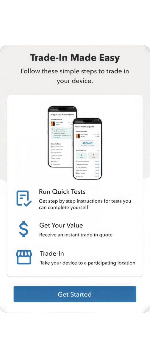
Let the phone's own hardware do the testing instead of asking the customer to self-report. Where a manual test was unavoidable, I turned it into something closer to a simple task than a technical form.
Show, don't ask
Where a customer's own input mattered — like judging screen condition — I replaced the old text questions with something they could actually interact with rather than guess at from a description. More on that below.
Automation first
The flow runs background hardware checks automatically — battery health, connectivity — before asking the customer to do anything by hand. That way people aren't asked for manual input on things the phone can just check itself.


The Expectation
What this was designed to solve
By replacing old, text-based questionnaires with the automated hardware tests I designed, the project successfully solved major business issues while creating a much smoother experience for customers.
1
More accurate pricing, by removing the guesswork
Letting the hardware test itself — instead of asking the customer to self-report condition — was meant to close the gap between the price a customer saw at home and what they got in-store. That mismatch was the single biggest source of customer frustration in the existing flow.
2
Faster in-store processing, by moving work earlier
Because the diagnostic work happens before the customer walks in, the design turns intake from a full manual retest into a scan-and-confirm — the QR code hands the store rep results that are already done, not a phone they have to test from scratch.
3
Built to scale without a rebuild
The component system was designed to extend to new phone models and the company's other retail sub-brands without redesigning it each time — a deliberate bet that this would need to flex fast around a flagship launch cycle, even though that scenario wasn't tested against real traffic.

The Takeaways
Key learnings as a designer
1
Losing progress mid-test kills trust quickly
This was a multi-step process customers were doing on their own, at home, sometimes over several minutes. If the app lost their progress partway through, most people weren't going to start over. Making sure the flow never dropped someone's place turned out to matter more than almost any other single design decision.
2
Being involved in backend meetings changed how I design
Understanding the actual constraints of the hardware testing — what the phone could and couldn't reliably detect — meant I could design around real limitations instead of designing something engineering had to push back on later.
3
Accessibility works better designed in
Building screen-reader support and non-gesture alternatives from the start, rather than retrofitting them, meant they were actually well-integrated into the flow instead of feeling like a separate track.
Try Out the Prototype
© Teodoro Studio 2026
Design systems · Product UX · Enterprise tools